Creating a space that you actually want to relax & focus in involves more than selecting comfy furniture. The paint you choose for your walls is just as important. If your walls are loud and vibrant, it's going to do nothing for your stress level. Take some inspiration from these calming rooms—they might just inspire you to pick up a paint brush and mellow out.
Oh and when that's all set, light your favourite candle and the work will flow out of you.
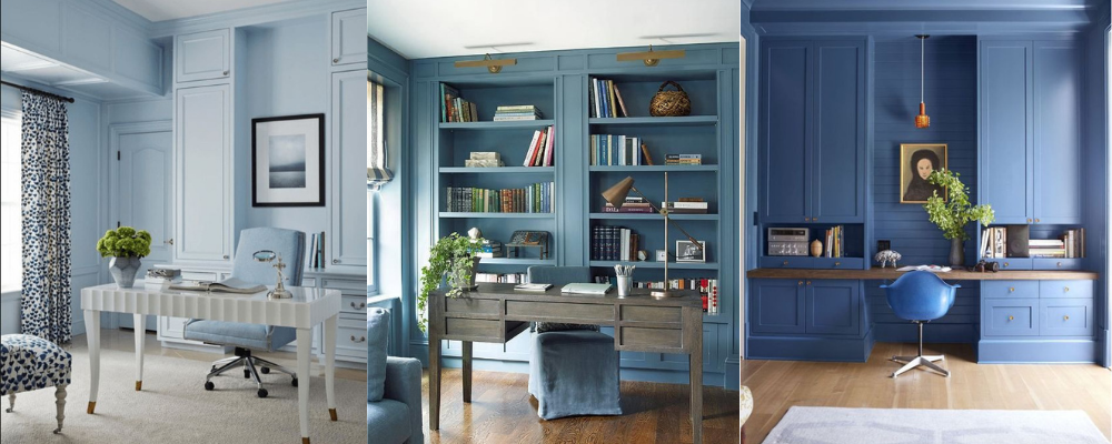
1. Light Blue
We all know how calming the colour blue is, it immitates the natural calming areas of the world, the sea and the sky, but have you ever thought about paiting your office blue? It looks almost like you're gazing at the sky on a cloudless day. What's more serene than that? I have picked out some light blue shades that I think are truley gorgeous!
Budget - B&Q - Clontarf Matt
Mid-range - Dulux - Blue Babe
High End - Graham & Brown - CIELO MATT
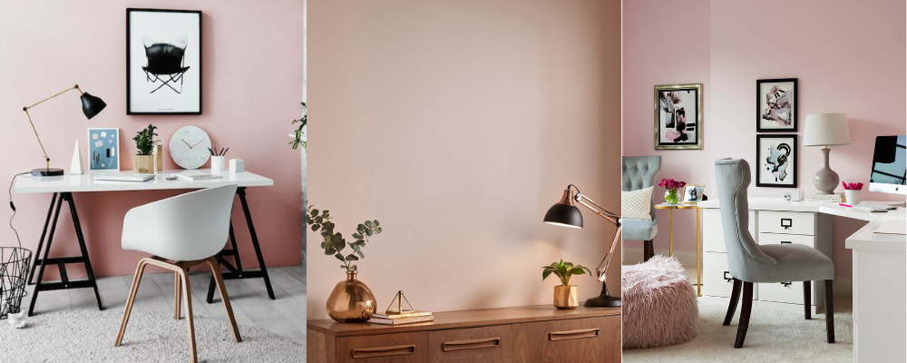
2. Blush
My fave!! A blush-painted room filled with plants and natural decor screams relaxation. It's the perfect space to sit back and get lost in a good book. A home office doesn't just have to be a home office!
My favourite shade of blush ever is Dulux Heritage - Blossom. This is a high-end paint, but most definitely worth it! Below are some cheaper options.
Budget - Dunelm - Rose Matt
Mid Range - Dulux - Blush Pink
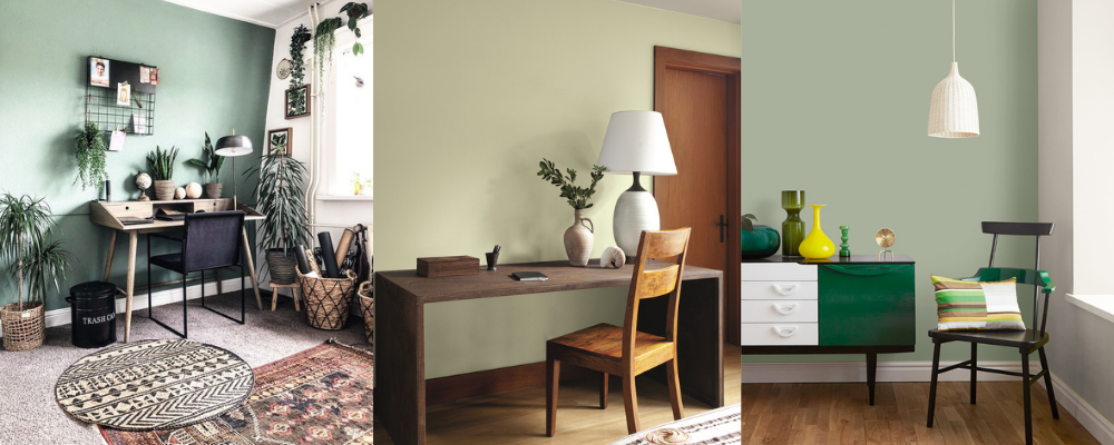
3. Sage Green
Choosing a muted sage green will make any space feel tranquil and it's super on trent at the moment too!
Budget - Wilko - Sage Silk
Mid-range - Dulux - Tranquil Dawn
High End - Graham & Brown - ACCRINGTON ROAD MATT
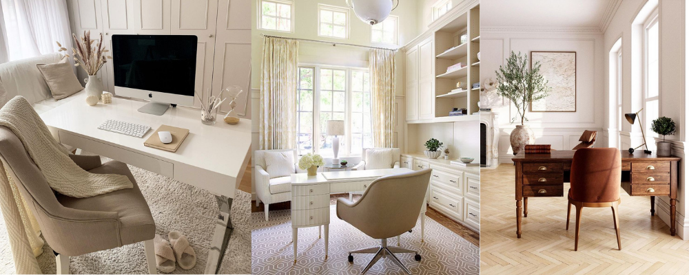
4. Beige / Neutrals
Will beige ever not look good?! Calming and chic, a neutral room is something you cannot get wrong! Here's some of my favourite shades.
Budget - B&Q - Santo Domingo
Mid-range - Johnstones - Chapel Stone
High End - Dulux Heritage - Setting Stone
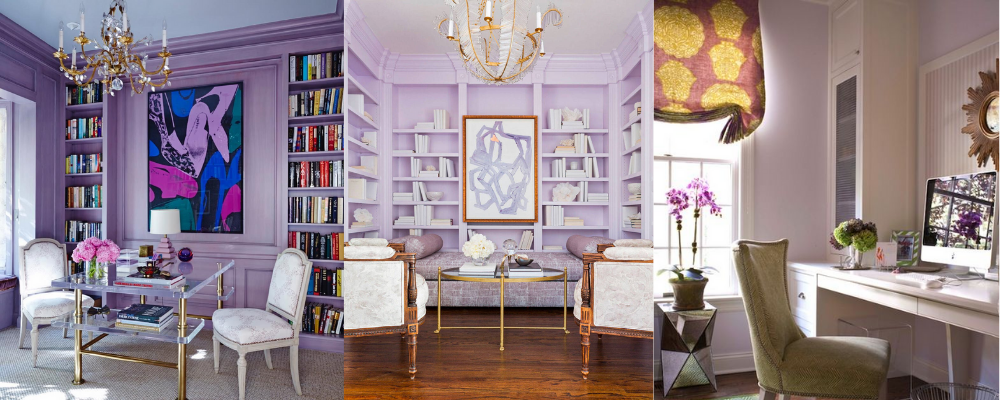
5. Lilac
Choose a purple with grey undertones, like lilac, so it doesn't feel too bold and vibrant. For accents, use creams and blues too!
Budget - B&Q - Hokkaido Silk
Mid-range - Dulux - Lavender Quartz
High End - Lick - Purple 01
6. Teal
The perfect mix between blue & green, a teal room can brighten it up and also calm you down! Top Tip! Put gold with Teal to get that rich luxurious look.
Budget - Home Base - Teal
Mid-range - Dunelm - Peacock Eggshell
High End - Graham & Brown - Jewel In the Crown
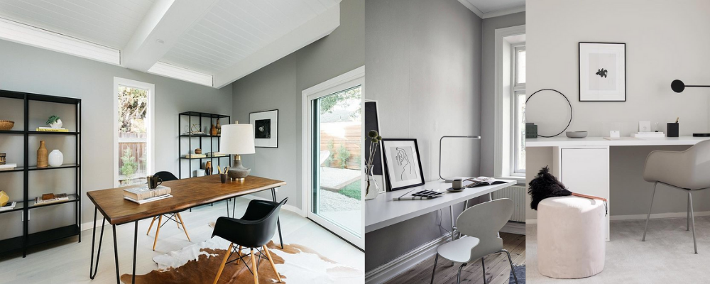
7. Soft Grey
You cannot go wrong with a grey! A colour that goes with everything! Pair it with some natural wood elements and you have a gorgeous scandavian office by just a lick of paint! My fave grey shades are below.
Budget - Home Base - Teal
Mid-range - Dunelm - Peacock Eggshell
High End - Graham & Brown - Jewel In the Crown
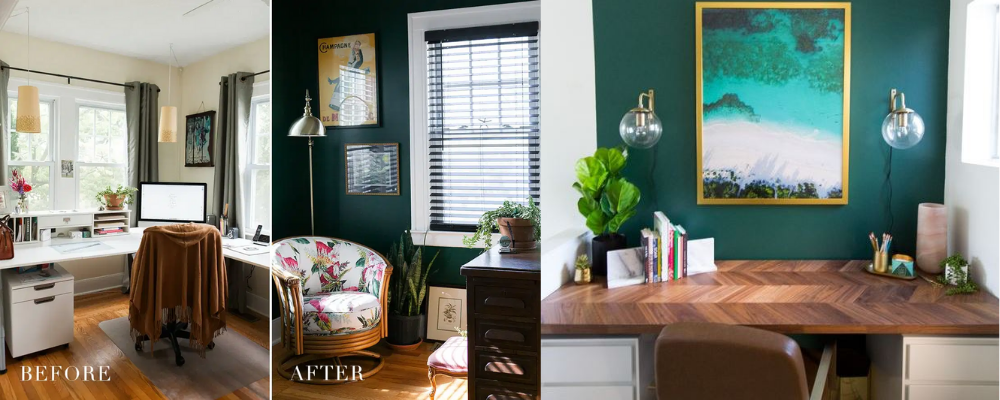
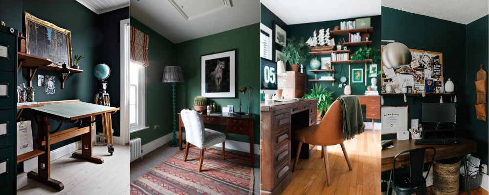
8. Dark Green
A dark green will make you feel like you're relaxing among nature, whether it's a park or the jungle.
Budget - B&Q - Milltown Matt
Mid-range - Dunelm - Emerald Matt
High End - COAT paints - Ditch The Tie Flat Matt | Very Dark Green Paint | COAT Paints
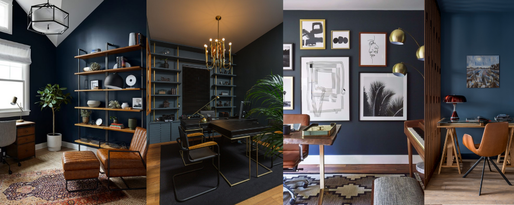
9. Dark Blue
Blue is the meaning of calm, but why not opt for a deep blue and pair it with rust furniture and natural woods or even opt for gold accents to give that 'rich' feel.
Budget - Wilko's - After Hours Matt
Mid-range - Dunelm - Luxe Navy Matt
High End - Graham & Brown - BRAVE MATT
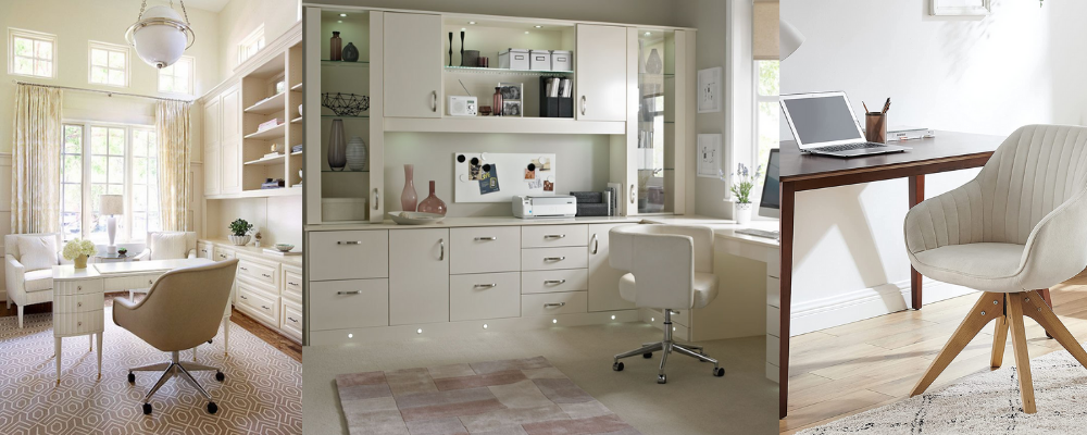
10. Off White
Not too bright not too dark, the off white paint is a perfect option as you can pair almost any colour with it and if you ever want to switch up colours you can too!
Budget - Wikes - Victorian White
Mid-range - Dulex - Summer Linen
High End - Farrow & Ball - Off White
 YouTube