
Installation projects
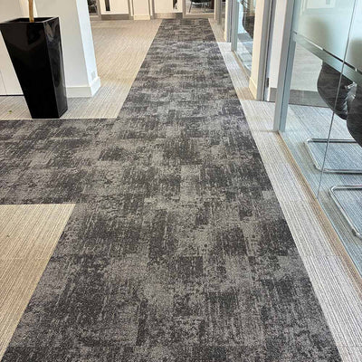
It's really simple and easy to get a fresh new look for your workplace - an affordable design that will bring the WOW factor to work. Whether your office is 100m2 or 1000m2, we can design and fit flooring that you will love. Our expert fitters are available up and down the UK and are just waiting for the ‘Avengers Assemble’ call to your location.
We’ve fitted flooring for everyone, from McDonalds to Toyota to offices in Canary Wharf and our list just keeps growing. Book your fitting today to get a great look just like all these projects.
Like what you see? Get the same expert fitting for your space.
Get a fitting quoteFeatured projects


All projects
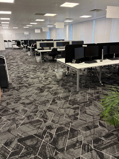
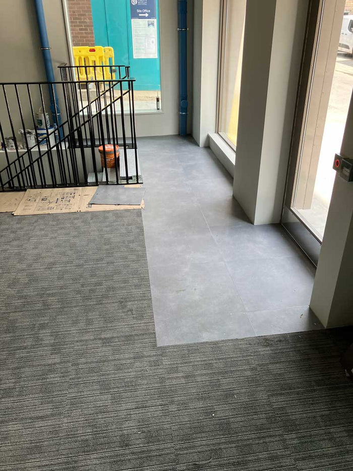
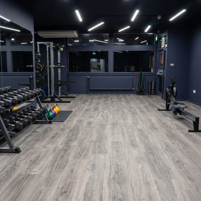
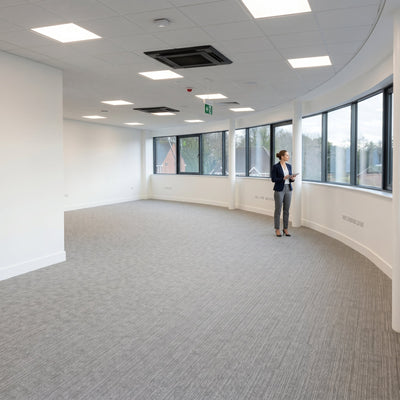
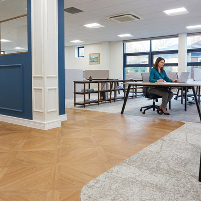
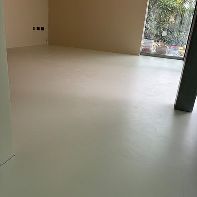
A 900m² Commercial Office
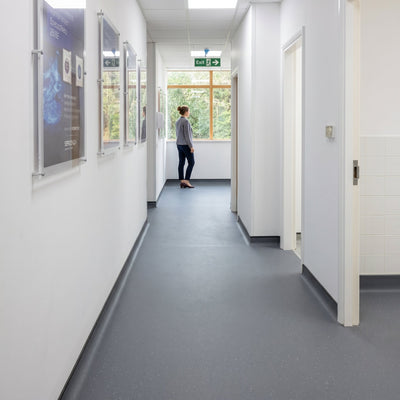
Royal National Institute of Blind People

GMB Offices
Liftd Design
H&G Car Parks
Servomex Group
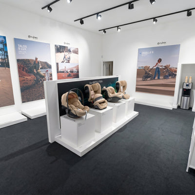
Cybex Pram Centre
Spectrum
Aston Bond LLP
Admiralty Quarter

The Story Museum
Flying Smart Offices

Domex
Mobius Specialist Property Services

Kavco
Klimstar

Music Studio London

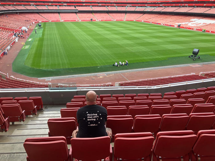
Arsenal FC Emirates Stadium
Love these projects? Let's do yours next.
Our CFA-approved fitters work nationwide, with a free site survey and free design service to bring your space to life. Tell us about your project and we'll come back with a no-obligation quote.
Nationwide fitting, fully managed
From free site survey to the final skirting, our team handles the lot.
Start your enquiry