Blue: a colour intermediate between green and violet, as of the sky or sea on a sunny day
Blue is currently dominating interiors - whether it's blue on the walls, blue soft furnishings or even blue floors?! Yes, some people do like to step beyond the world of grey with their flooring choices.
Blue is grounding, it is reassuring and most importantly it is everywhere. And if you’ve not noticed it everywhere, we apologise because you for sure will now after reading this post - you’ll have blue on the brain.
An all time interior classic, there has always been a huge buzz around the colour blue, Pantone even named Classic Blue as their colour of the year 2020 and to be honest it comes as no surprise to us. It’s clean, it’s elegant and it’s super duper easy to incorporate into all parts of the home or workplace. With a huge colour palette ranging from the deepest depths of the ocean to the cloudy skies above, it oozes a sense of calm, relaxation and escapism.
Our carpet tile products offer a vast range of shades for you to choose from to incorporate this timeless colour into your interior. So, which will you choose?
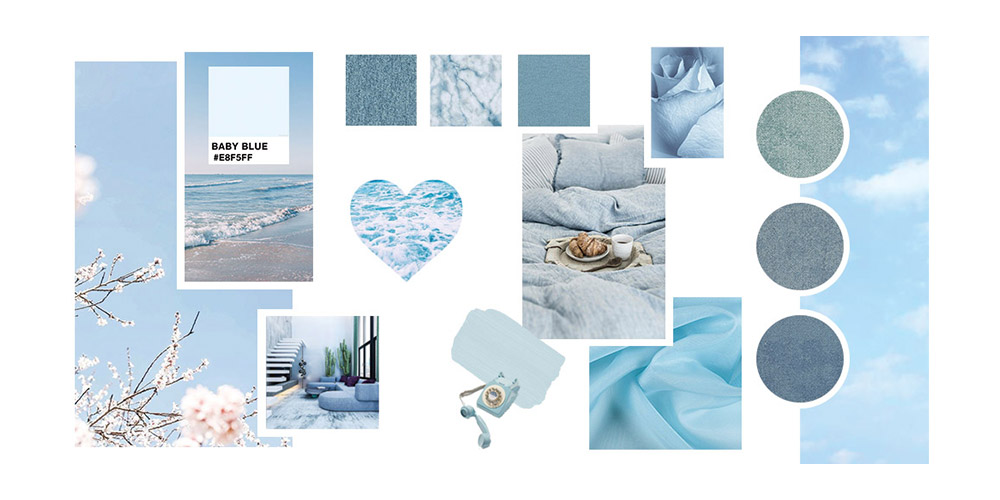
Baby Blue
Just like a morning sky in sunny Philadelphia with a the odd fluffy cloud floating above, light blue hues help us to filter out background noise and focus on what truly matters thanks to the sense of calm and stability it brings.
Peaceful and calming, exposure to light blue has been shown to increase confidence and happiness levels in individuals. Its gentle appearance is also believed to promote healing, tranquillity and softness in turn helping us to switch to this more mindful mindset.
Well we certainly would feel a lot calmer if we could lie on our backs and look into a baby blue cloudless sky all day long.
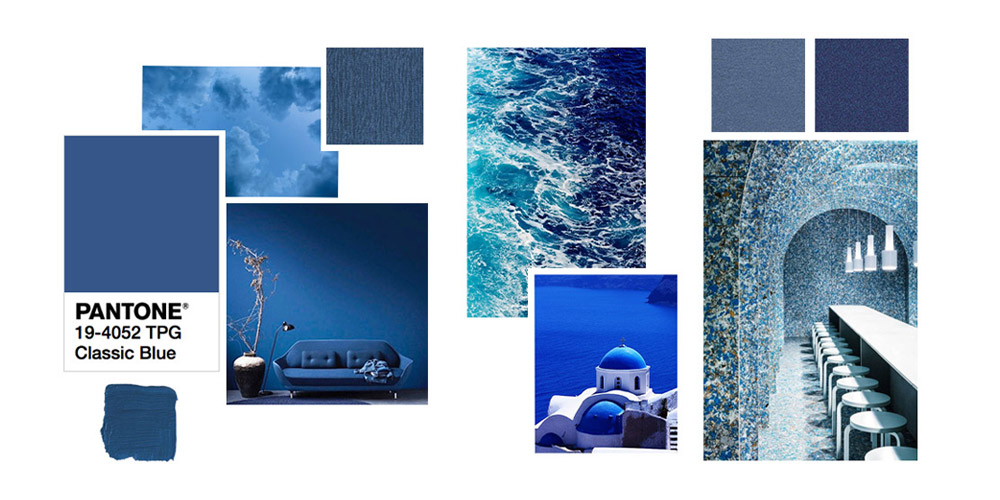
Classic Blue
A shade reminiscent of the sky at dusk and associated with the return of another day, Classic Blue is elegant in its simplicity.
Blue tones are known to be evocative of trust, confidence and stability - just a few of the many things we tend to be lacking in these modern days. Classic Blue perfectly taps into those feelings as it promises honesty and protection from the increasingly disconnected world.
Installing confidence and connection, Classic Blue helps us to regain trust in the authority and re-centres our trailing thoughts.
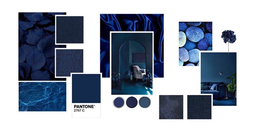
Dark Blue
Lets hop on over to the darker side of life to Dark Blue and Navy tones. Dark blue is said to represent knowledge, power, integrity and seriousness (sounds intense).
Popular in corporate interiors or designs where strength and reliability are important. dark tones can endorse optimism and spark happiness.
These shades however can appear cold and passive, so why not mix them with white, yellows or the ever so popular terracotta to create a pop of colour with a darker backdrop. Check out our recent blog post on Eclectic Glamour to dive into all things navy, velour, gold and more.
The best thing about blue though did I hear you ask?
It is just always relevant. Thanks to its wide range of hues it offers, it is super easy for interior designers to keep finding fresh alternatives to the overused shades of previous years.
So for those of you that dares to stray away from more conventional combinations but aren’t quite ready to jump in the deep end with something too psychedelic, then blue and navy are sure to float your boat.
Shop all things blue over at DCTUK