Now that we are 2 whole weeks into the Spring season, even though this English weather does not seem to be agreeing, it’s time for you to hone in on the current interior trends. We’ll be looking at gelato shades (yes, they look as yummy as it sounds), blurred boundaries and Indigo dreams.
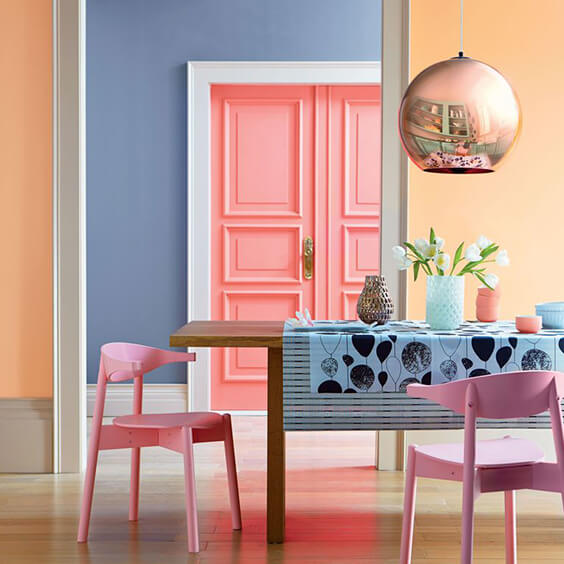
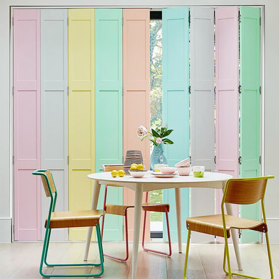
Let’s start off with gelato colours since we can finally enjoy a treat from the ice cream man. Well, if you’re okay with getting a goosebump or 2 as the sun’s not exactly cracking the flags! These ice cream shades are a big theme this Spring/Summer not only with interiors but with fashion too. From bubblegum blue to cotton candy pink and even a touch of fresh minty greens; these contrasting colours complement each other nicely to create a pastel palette dream without overpowering the room. I believe the key to implementing this look is to keep a neutral backdrop whether that’s grey, white, cream or even black and administer the ice cream shades through decorative features.
Here at DCTUK we have some amazing carpet tiles that could assist you in perfecting this look. My personal favourite being Heckmondwike Broadrib – Peacock; a vibrant blue tone that will have mouths watering with yumminess. Here are my remaining sorbet carpet tile top picks: Heckmondwike Supacord, Burmatex Cordiale and Modulyss First.
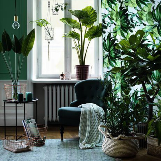
So, you may have been wondering what I meant by blurred boundaries and it’s simply the current craze of bringing the outside in; the correct term being biophilic design. Due to increasing studies on the health benefits of nature and greenery being part of our work and home spaces house plants are now a must-have item. Basically, the more jungle-like the better. However, I do understand that this isn’t always the most convenient way to be living. Lot’s of watering, many dead plants; not good mate! The great, and very simple, solution to this is to ‘trick’ the brain into making it feel as though a space is more earthy and green. This means green tones are set to dominate this year and, in my opinion, the leafy shade will remain at the forefront of design for many years to come.
The Nouveau Core collection is my one true love when it comes to this trend as it’s not an overwhelming tone that evokes pounding headaches. It’s a very organic, yet classic, design-led tile which mimics neutral forest patterns. My other biophilic carpet tile choices consist of: Nouveau Carnival, Nouveau Elements ll, Interface Urban Retreat 101 and Modulyss Patchwork.
Last but definitely not least, indigo blues. The tone of elegance and mystery and the complete opposite of ice cream colours. As you can tell, bold shades are hot, hot, hot this year with sumptuous dark blue being a big contender for first position. If you’re the type of daring person that can drench your space in ‘all indigo everything’ then respect goes out to you. But if, like me, you’re a little bit more reserved when it comes to testing out a new trend smaller accents such as vases, cushions and rugs are a good way to go. Indigo blues and gold metallics are match made in heaven, a perfect harmony, the best thing since strawberries and cream! Add in gold metallics to your space to make the blue tones really POP!
Looking for flooring that will support your indigo visions? Well look no further! Interface Series.1.301 – Denim is a durable, contemporary carpet tile that subtly incorporates blue tones into a dark, black backdrop. My further dreamy indigo carpet tile favourites: Nouveau Connections – Sea Blue & Sky Blue, Nouveau Essentials, Digital Lines and Heckmondwike Supacord.